



Equipe Mallorca (Myorka) Cream EM-44-CR 4 x 4 Zellige Look Ceramic Tile
Choose your option


MBC Brick Road Lombard Street 3 x 10
Choose your option


Equipe Mallorca (Myorka) Cream EM-28-CR 2 x 8 Zellige Look Ceramic Subway Tile
Choose your option


Batik Mystique Porto 8 x 8
Choose your option


Nirvana Bliss Seaside NBO1092 Porcelain Pebble Mosaic Tile
Choose your option


New Belfont Italica Charm NBT-5431 2" Hexagon Matte Recycled Glass Mosaic
Choose your option


Hearth Palace Penny Round Kara Beige HP1PRKBG
Choose your option

Mykonos Harbor Series Thasos Cliff MKH-1603
Choose your option


Grenada Views Cordoba Mist GV-5403 1" Hexagon Matte Recycled Glass Mosaic
Choose your option


Nantucket Surfside NNR-04BL Matte Recycled Glass Subway Mosaic
Choose your option

Orbesque 2 inch round OBQ-6091 Goladin
Choose your option
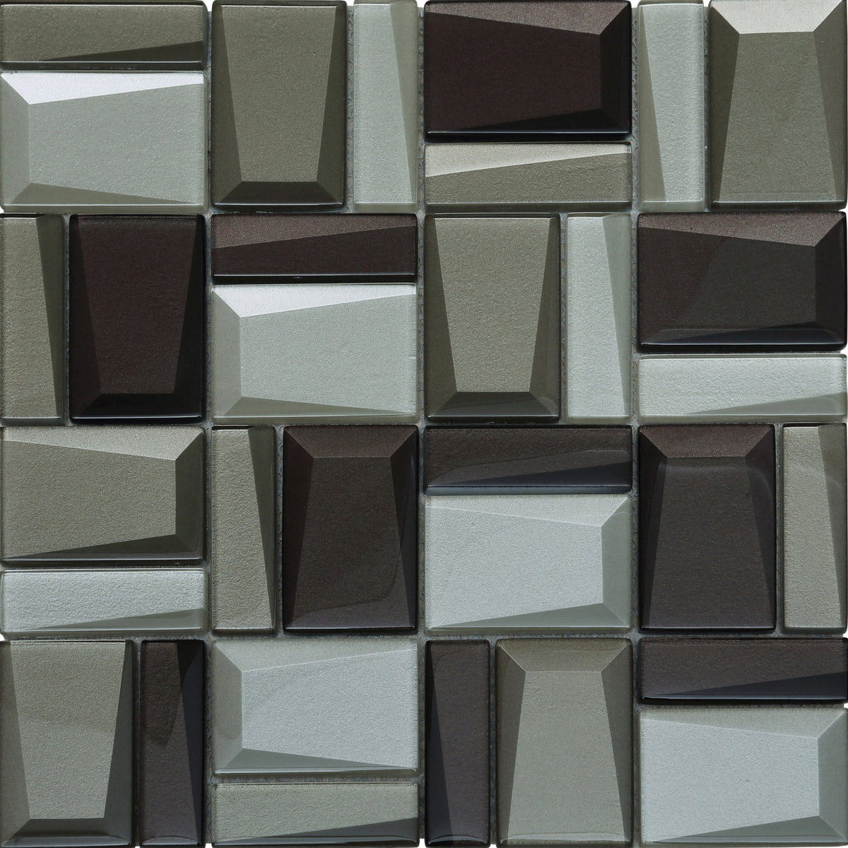
Facet Series Asscher Beveled Glass Mosaic 412-203
Choose your option


Amalfi Coast Porcelain Tile Vidal Burano 0GZ20DE
Choose your option


Manacor Beige Argile MAN-26913 4 x 4 Zellige Look Ceramic Tile
Choose your option
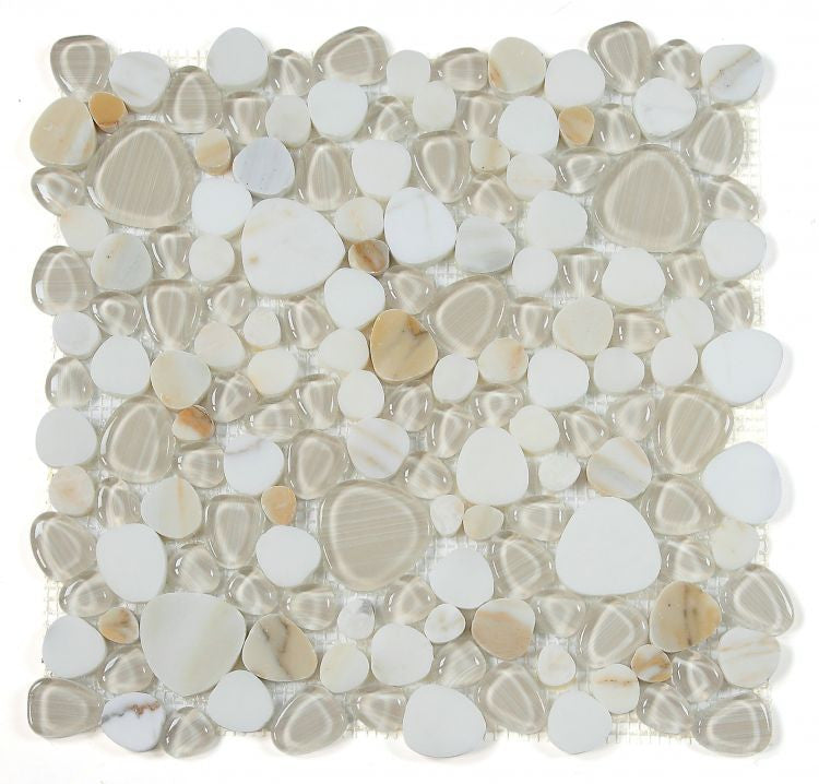

Calacatta Gold NB3926 Marble and Glass Pebble Mosaic Tile
Choose your option


Nirvana Bliss Calacatta Gold Honed Marble Sliced Pebble Mosaic | NB3612
Choose your option


Reya Topo RYA-6432 Cream 3x12 Matte Textured Porcelain Tile
Choose your option
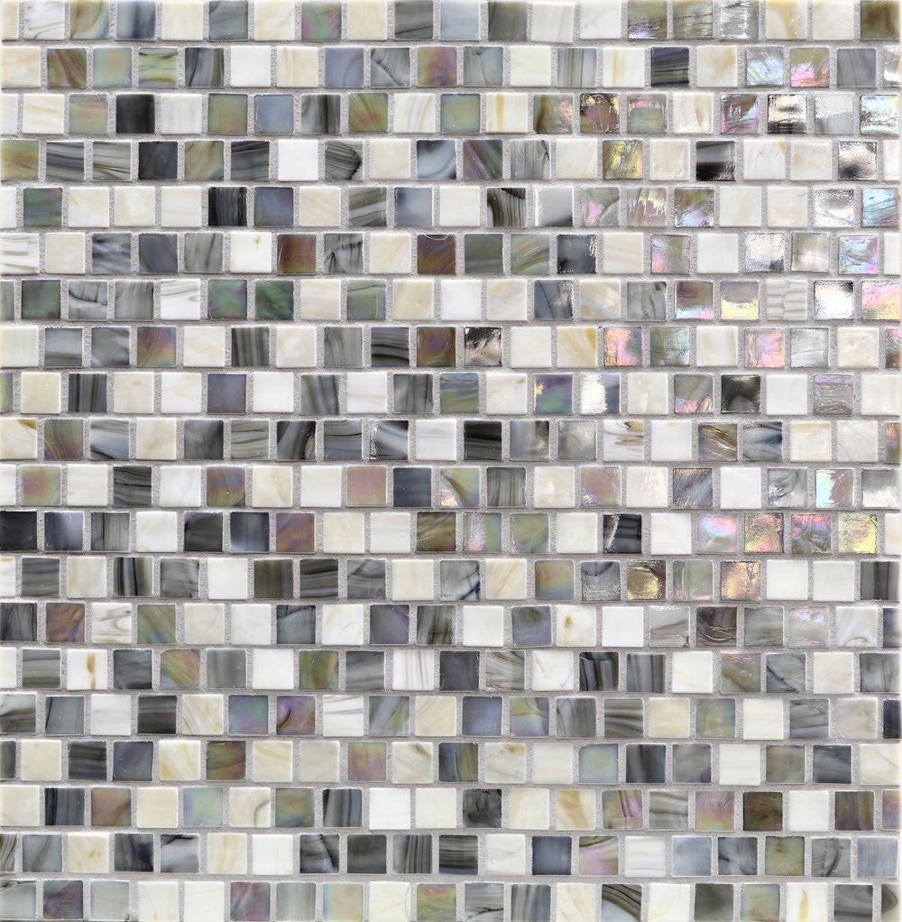
Murrine Aquarius Blend Triton AQR-5/8x5/8-TRITON Iridescent Recycled Glass Mosaic
Choose your option


Elios Ceramica Clay Linen Linen-4x4 Glossy Handmade Look Ceramic Tile
Choose your option
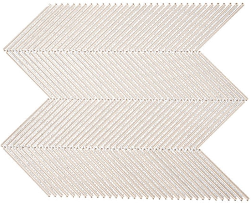
Viola Capri VLI-6013 Belvedere Gio
Choose your option

Cosmopolitan Axis Ankara Glossy SSA-1212
Choose your option


Island Wharf Aussie Beach 3 x 12
Choose your option

Vista Chino VTC-6102 Gracious Pink
Choose your option


Diamond Series Crema Marfil | Emperador Dark | Thassos White DS56
Choose your option

Equipe Mallorca Cream Satin Ceramic 2 x 8 Bullnose Trim | TLEQMYRKCRMBN2X8
Choose your option
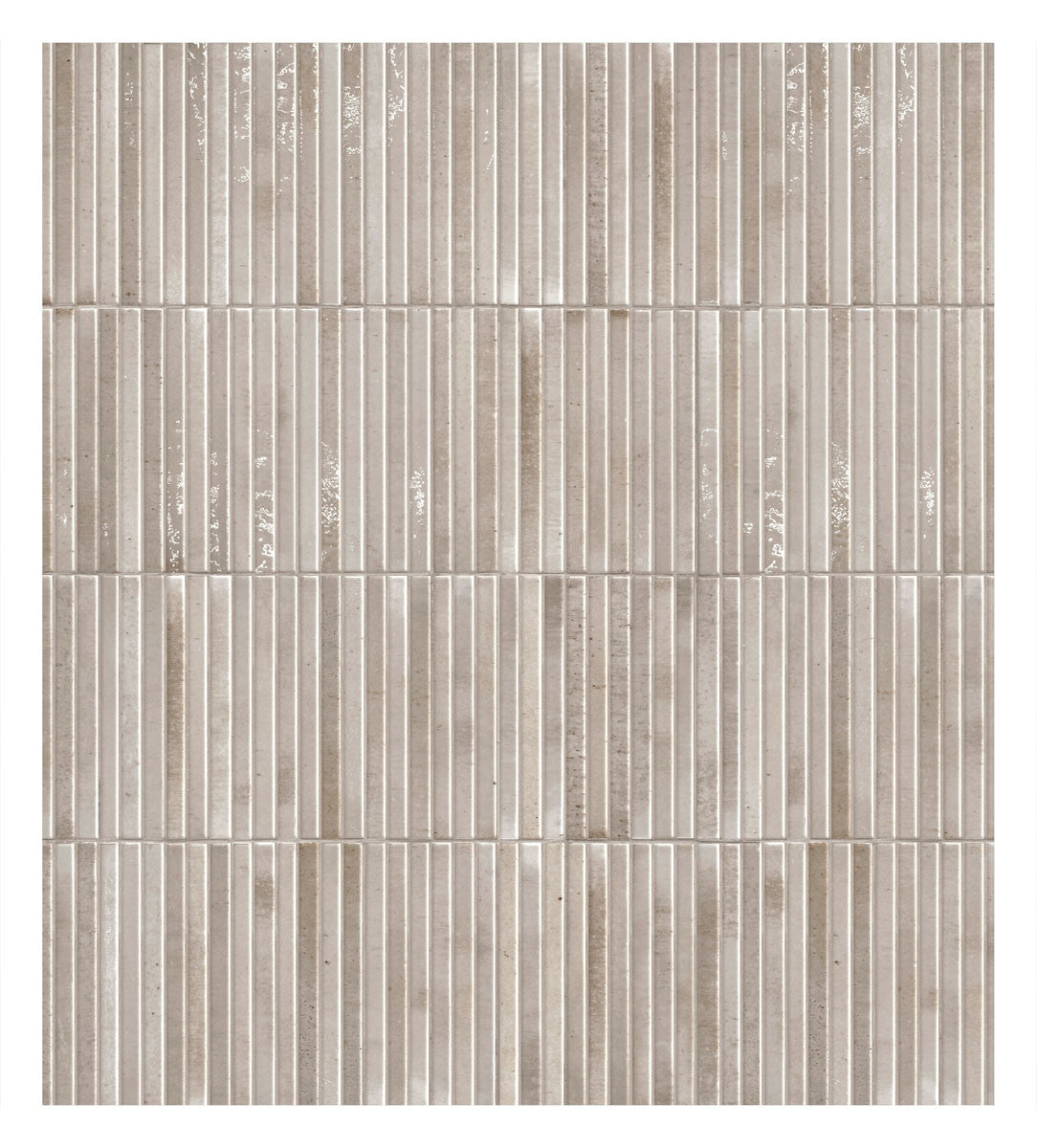

Home Series Honey HOME-HONEYKITKAT Warm 5x10 Kit Kat Porcelain Wall Tile
Choose your option
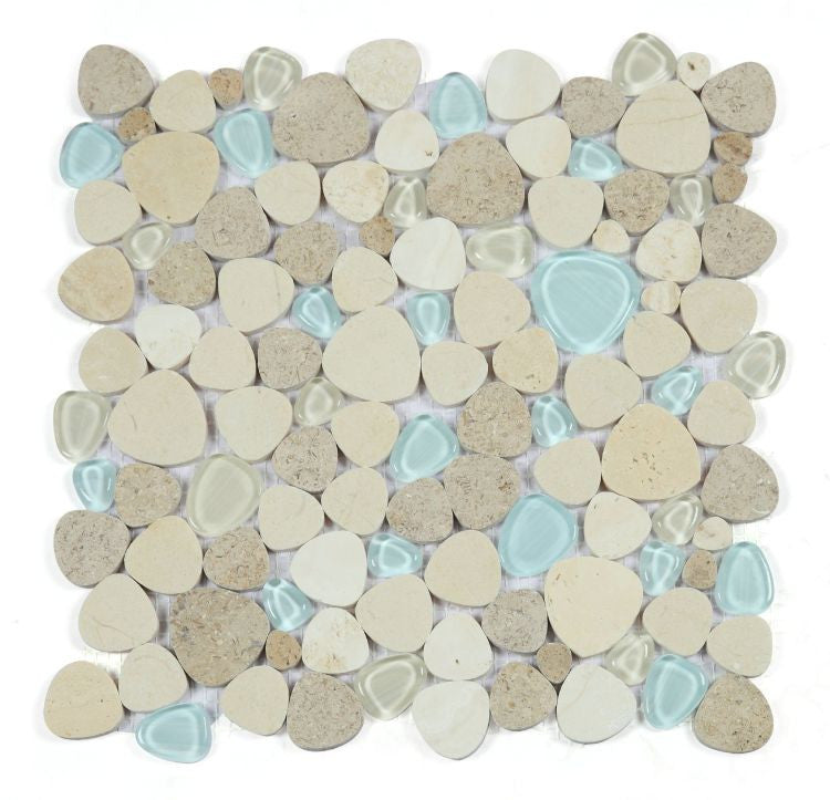

Blue Roma NB4632 Beige Marble and Blue Glass Pebble Mosaic Tile
Choose your option


Atlas NB743 Blue, Cream and Brown Porcelain Pebble Mosaic Tile
Choose your option


Chiseled Dreams Neyland Daze CDR-5592 Elongated Hexagon Crackle Recycled Glass Mosaic
Choose your option
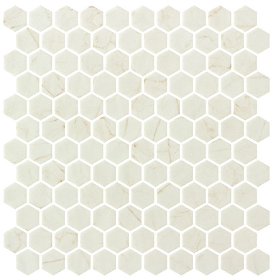

Grenada Views Spania Taupe GV-5402 1" Hexagon Matte Recycled Glass Mosaic
Choose your option


Nantucket Surfside Herringbone NNC-06BL
Choose your option

Cosmopolitan Stacked Brick Ankara Glossy SSA-1216
Choose your option

Decko DEK3511 Mid Century Hexagon Mosaic
Choose your option
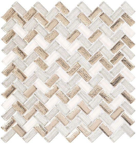
Larati Lane Chiara Fawn LRL3202
Choose your option

Colonial 2 Inch Hex Bay Colony CLNL271
Choose your option

Holy Trail HT-149 marble mosaic Mount Zion
Choose your option
Cream Tile Is Warmer Than White and Easier to Live With
Cream and beige tile sits in a sweet spot. It’s light enough to keep a room bright, but it has enough warmth that it never feels cold or clinical the way a stark white wall can. It’s also a lot more forgiving. A cream backsplash doesn’t show every splash, and a beige floor doesn’t announce every footprint.
The catch is that “cream” covers a lot of ground. One cream tile leans buttery yellow, another has a hint of pink, and a third reads almost gray. Those small differences are what make one cream tile look perfect in your room and another look a little off.
This page walks you through the shades, materials and pairings so you can pick the right one the first time.
Cream vs. Ivory vs. Beige vs. White: What’s the Difference?
These names get used interchangeably, but they’re not the same color.
White has little or no warmth. It can look crisp and clean, or cold if the light is cool.
Ivory is white with just a touch of warmth. It’s the closest step away from white and works almost anywhere white would.
Cream is noticeably warmer, with a soft yellow or golden tone. It feels cozy and a little old-fashioned in the best way.
Beige goes a step darker, into sand, latte and light tan. It reads as a true neutral rather than an off-white.
Taupe and greige are beige with gray mixed in. They’re the coolest of the warm neutrals and pair easily with gray stone and modern finishes.
If you want a crisp, bright look, start with our white tile. If you want warmth, you’re in the right place.
How to Read Cream and Beige Undertones
Undertone is the color hiding underneath the main color, and with cream tile it makes all the difference. Most cream and beige tiles lean one of three ways.
Yellow or golden undertones feel the warmest and most traditional. They look great with wood, brass and warm white cabinets.
Pink or peach undertones feel soft and a little romantic. They can look beautiful in a bathroom but may clash with green-gray countertops.
Gray undertones feel calmer and more modern. They’re the safest choice next to gray stone, quartz or cool white fixtures.
Here’s an easy trick. Hold your sample next to a plain sheet of white printer paper. The undertone pops right out once it’s sitting beside true white.
Will Cream Tile Look Dirty Next to White?
This is the number one mistake we see with cream tile, so it gets its own section.
When cream tile sits right next to bright white cabinets, a white tub or a white toilet, the white can make the cream look dingy or yellowed. At the same time, the cream can make the white look stark. Neither one looks its best.
You can avoid it a few ways:
Choose an ivory or a very soft cream when it will sit directly against bright white.
Let the contrast be obvious. A clearly beige or sand tile next to white looks intentional, while a cream that’s almost white looks like a mismatch.
Match your fixtures. If you’re replacing the tub or vanity anyway, a warmer white or biscuit finish ties in with cream tile.
Always hold your sample against the actual cabinet door, tub or countertop before you order.
Popular Looks in Cream and Beige Tile
Zellige and Handmade-Look Tile
Cream is one of the best colors for zellige-style and handmade-look tile. The glaze pools and shifts across each piece, so you get subtle movement from light buttercream to deeper sand. It feels relaxed and collected, never flat.
Shop zellige-look tile or shop handmade-look tile
Cream Subway Tile
A cream subway tile is the warmer cousin of the classic white subway backsplash. It still feels timeless, but it softens the kitchen and plays nicely with wood counters and brass hardware.
Stone and Marble Looks
Crema marfil, travertine and limestone are naturally cream and beige, which is why stone-look tile is such a big part of this color family. You get gentle veining and movement without a busy pattern.
Mike likes pairing a cream marble-look tile with a warm brown in a checkerboard for an old-world floor.
Shop porcelain tile or shop natural stone
Glass and Pebble Mosaics
Cream and beige glass catches the light in a way glazed tile can’t. Pebble and mixed stone-and-glass mosaics bring in texture that feels natural and coastal.
Shop glass tile or shop pebble mosaics
Shop Cream Tile by Room
Cream Backsplash Tile
A cream backsplash warms up white or wood cabinets and hides everyday splashes better than bright white. It’s especially good with butcher block, warm quartz and brass hardware.
Explore Cream Backsplash Tiles for kitchen ideas, cabinet pairings and grout tips.
Cream Bathroom Tile
Cream bathroom tile feels calm and spa-like without the hospital-white effect. It works on shower walls, around the tub and behind the vanity, as long as you watch how it sits next to white fixtures.
Browse Cream Bathroom Tiles for shower and vanity ideas.
Cream and Beige Floor Tile
Beige floors are popular for a reason. They hide dust and dirt better than white or black, and they make a room feel open and bright. Stone looks, matte porcelain and natural stone are all strong choices.
Shop Cream Floor Tiles for floor-rated options.
Fireplace Surrounds
Cream tile around a fireplace keeps the focus on the fire and pairs beautifully with wood mantels and warm stone hearths.
Ceramic, Porcelain, Glass or Stone?
Ceramic gives you the widest range of cream glazes, from glossy and smooth to handmade and uneven. It’s a great choice for backsplashes and bathroom walls. Shop ceramic tile
Porcelain is tougher and absorbs very little water, so it’s the go-to for floors and showers. It’s also where you’ll find most stone and marble looks.
Glass adds shine and depth. Cream glass mosaics bring light into a dim backsplash or shower niche. Shop recycled glass tile
Natural stone gives you real variation no factory can copy. Expect to seal it and to stay away from acidic cleaners. Shop marble mosaic tile
What Goes With Cream and Beige Tile?
Natural wood is the classic partner. White oak keeps things light and modern, while walnut adds richness and contrast.
Brass and bronze hardware look right at home against cream. Matte black hardware adds a sharper, more modern edge.
Sage, olive and deep green cabinets look beautiful with cream tile. It’s one of the most popular combinations right now.
Terracotta, rust and warm brown accents lean into the Mediterranean side of cream.
Soft gray works too, but choose a cream with a gray or greige undertone so the two don’t fight. If you’re going for a warmer, earthier palette, take a look at our brown tile.
Cream Tile and Decorating Style
Farmhouse: cream subway or handmade-look tile with wood shelves and black or brass hardware. Shop farmhouse-style tile
Coastal: sandy beige, pebble mosaics and soft glass in shades that feel like the beach. Shop coastal-style tile
Traditional: cream marble looks, crema marfil and classic patterns that never go out of style. Shop traditional-style tile
Choosing Grout for Cream Tile
Skip the bright white grout. It almost always makes cream tile look yellow by comparison.
A matching cream or warm off-white grout lets the tile read as one soft surface, which is ideal for zellige and handmade looks.
A light beige or warm gray grout gives a little definition without harsh contrast. It’s also more forgiving on floors and backsplashes, where grout picks up the most dirt.
For a bold look, a darker grout outlines every tile. It works best with simple shapes like subway and square.
Lighting Changes Everything
Cream is one of the most light-sensitive colors you can choose. Warm bulbs push it toward yellow, cool bulbs pull it toward gray, and north-facing rooms can make it look flat.
Before you order, look at your sample in the morning, in the afternoon and at night under your actual light fixtures. If your kitchen has warm under-cabinet lights, check the sample there too. It may look completely different than it did in the box.
What to Check Before You Order
Start with the room and the surface. Backsplash tile, shower tile and floor tile all have different requirements, so make sure the tile is rated for where it’s going.
Next, compare samples against everything that’s staying: cabinets, countertops, fixtures and flooring.
Look closely at shade variation. Handmade-look and natural stone tiles vary from piece to piece, so open several boxes and blend them as you install. That’s one of Mike Belk’s go-to tips for any tile with natural variation.
Finally, order a little extra. About 10% covers cuts and waste on most jobs, and a few spare tiles on the shelf will save you a headache if you ever need a repair.


